- 浏览: 272585 次
- 性别:

- 来自: 东方水城
-

文章分类
最新评论
-
18335864773:
pageoffice 插件 可以实现 office文档的在线操 ...
Java调用com组件操作word -
coosummer:
推荐使用在线免费bug管理系统- bug 禅思:http:// ...
Bug管理工具 -
program_coco:
柠檬bug管理系统,一个在线的bug管理系统。www.lemo ...
Bug管理工具 -
影非弦:
这个in.read(data);//data是一个byte[] ...
Java串口通信总结 -
影非弦:
这个不详细啊,我弄了一天了,都没弄出来,总是出错,读信息的时候 ...
Java串口通信总结
仪表盘是商业智能领域必不可少的一个工具,然而大多数企业仪表盘目前仍然需要自定义创建。现在,Flash图表AnyChart 的AnyChart Flash Component Dashboard mode 提供了一种创建仪表盘的新方式。所有通过AnyChartFlash图表组件创建的图表都要用一个单一的swf文件渲染,然后将图表应用到网页中。本教程将手把手教你用AnyChart Flash组件创建一个数字仪表盘。
1、选择要显示的数据
假设你要在年会上给股东展示报表,你手头有产品的销售数据、盈利数据、产品流行排行榜等数据资料,你首先要从这些繁杂的资料当中选出你想要展示的数据。
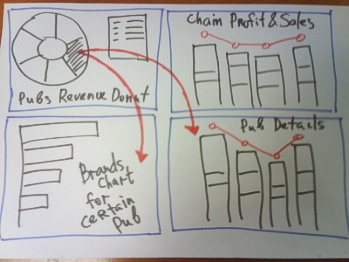
2、选择布局
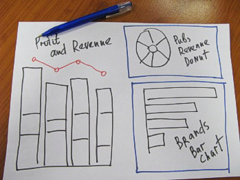
通常,在确定最完美的布局之前你最好先在纸上简单的画一画,做到心中有数:
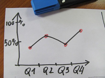
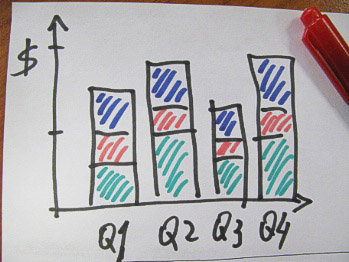
画出仪表盘的大致布局:
3、转换数据
接下来用 AnyChart - XML配置文件转换数据。首先需要将数据转换成XML,代码示例:
<anychart>
  <charts>
    <!-- Set plot_type to display chart as Doughnut-->
    <chart plot_type="Doughnut" template="template_bg">
      <data>
        <!-- One data series to show pubs revenue -->
        <series>
          <point name="Nevada Cocktail Lounge" y="4.173" />
          <point name="Washington Highway Pub" y="3.77" />
          <point name="Florida Beer Restaurant" y="3.5" />
          <point name="Texas SteakHouse" y="4.14" />
          <point name="Georgia Ale House" y="1.675" />
        </series>
      </data>
      <data_plot_settings>
        <pie_series style="Aqua">
          <!-- Enable tooltips and set them to show revenue, percentage and pub name -->
          <tooltip_settings enabled="true">
            <format>{%Name} / ${%YValue}{numDecimals:2} mil. / {%YPercentOfSeries}{numDecimals:2}%</format>
          </tooltip_settings>
          <!-- Enable labels and set them to show percentage -->
          <label_settings enabled="true" mode="inside">
            <position anchor="Center" valign="Center" halign="Center" />
            <background enabled="false" />
            <font color="White">
              <effects enabled="True">
                <drop_shadow enabled="True" />
              </effects>
            </font>
            <format>{%YPercentOfSeries}</format>
          </label_settings>
        </pie_series>
      </data_plot_settings>
      <chart_settings>
        <!-- Set chart title text -->
        <title>
          <text>Pubs Revenue Ratio</text>
        </title>
        <!-- enable legend to show data points -->
        <legend enabled="True" ignore_auto_item="True">
          <title enabled="false" />
          <items>
            <item source="Points" />
          </items>
        </legend>
      </chart_settings>
    </chart>
  </charts>
</anychart>
这样我们就创建了一个<series>节点,新增几个<point>节点,并设置名称,定义<chart>节点中的plot_type="Doughnut",设置格式化的工具提示、标签和图表标题,效果如图所示:
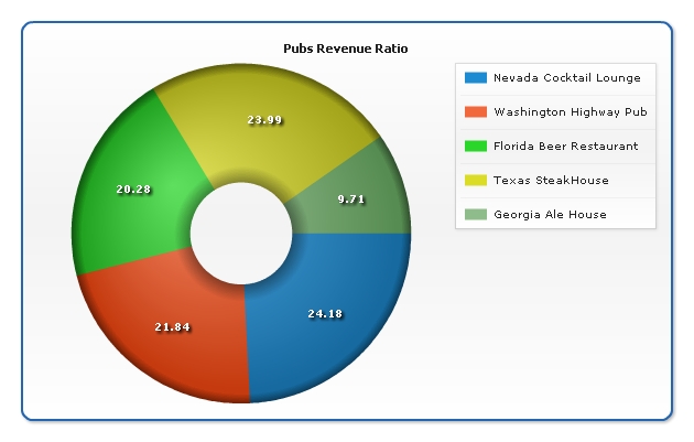
然后将这个配置文件保存为pubs-revenue.xml.
4、转换布局
前面我们在纸上设计了一下仪表盘的布局,下面我们将纸上布局转换到AnyChart仪表盘布局配置中。
1) 在<anychart>节点中创建<dashboard>节点,创建<view type="Dashboard">,示例如下:
<anychart>
  <dashboard>
    <view type="Dashboard">
      <title>
        <text>"Duff Pubs" Annual Report</text>
      </title>
    </view>
  </dashboard>
</anychart>
2)我们有三个图表,所以需要三个<view type="Chart">:
<anychart>
  <dashboard>
    <view type="Dashboard">
      <view type="Chart" />
      <view type="Chart" />
      <view type="Chart" />
    </view>
  </dashboard>
</anychart>
3)首先我们将这三个图表水平放置:
<anychart>
  <dashboard>
    <view type="Dashboard">
      <hbox width="100%" height="100%">
        <view type="Chart" />
        <view type="Chart" />
        <view type="Chart" />
      </hbox>
    </view>
  </dashboard>
</anychart>
4)然后将其中两个垂直放置,并调整宽高:
<anychart>
  <dashboard>
    <view type="Dashboard">
      <hbox width="100%" height="100%">
        <vbox width="50%" height="100%">
          <view type="Chart" width="100%" height="50%" />
          <view type="Chart" width="100%" height="50%" />
        </vbox>
        <view type="Chart" width="50%" height="100%" />
      </hbox>
    </view>
  </dashboard>
</anychart>
5、将数据和布局放在一起
准备好了数据和布局后,接下来就要为仪表盘视图指定特定的数据源:
<anychart>
  <dashboard>
    <view type="Dashboard">
      <hbox width="100%" height="100%">
        <vbox width="50%" height="100%">
          <view source="./dashboard/profit-and-sales.xml" type="Chart" width="100%" height="50%" />
          <view source="./dashboard/pubs-revenue.xml" type="Chart" width="100%" height="50%" />
        </vbox>
        <view source="./dashboard/brands-chart.xml" type="Chart" width="50%" height="100%" />
      </hbox>
    </view>
  </dashboard>
</anychart>
6、交互性概念规划
我们需要创建通过点击某个点就能显示出具体销售数据的仪表盘,如下图:
7、交互式仪表盘的数据
现在我们需要创建更多的XML文件。
注:可以用AnyChart的图表模板轻松实现图表配置
8、交互式仪表盘的实现
我们可以用AnyChart Actions实现仪表盘数据的更新,在这个仪表盘中我们只用 "updateView",就能更新仪表盘的某个视图。修改图表的数据部分,如下示例:
<data>
  <series>
    <actions>
      <action type="updateView" view_id="Profit Details" source_mode="externalData" source="{%Name}_profit-and-sales.xml" />
      <action type="updateView" view_id="Brands Details" source_mode="externalData" source="{%Name}_brands-poularity-chart.xml" />
    </actions>
    <point name="Nevada Cocktail Lounge" y="4.75" />
    <point name="Washington Highway Pub" y="3.75" />
    <point name="Florida Beer Restaurant" y="3.4" />
    <point name="Texas SteakHouse" y="3.1" />
    <point name="Georgia Ale House" y="2" />
  </series>
</data>
最后我们要做的就是安排新的仪表盘布局,设置适当的图表来源和视图名称(用于更新操作):
<anychart>
  <dashboard>
    <view type="Dashboard">
      <vbox width="100%" height="100%">
        <hbox width="50%" height="100%">
          <view source="./dashboard/pubs-revenue.xml" type="Chart" width="100%" height="50%" />
          <vbox height="100%" width="50%">
            <view source="./dashboard/profit-and-sales.xml" type="Chart" width="100%" height="50%" />
          </vbox>
        </hbox>
        <view name="Brands Details" source="./dashboard/brands-chart.xml" type="Chart" width="50%" height="100%" />
      </vbox>
    </view>
  </dashboard>
</anychart>
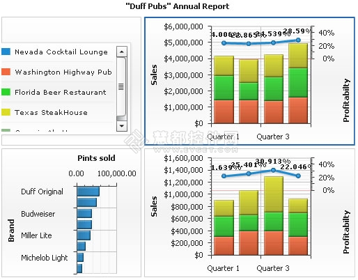
9、Flash交互式仪表盘
效果图:
结语
以上我们用 AnyChart 创建了一个简单的Flash交互式仪表盘,但它还是一个相当静态的仪表盘。本教程是用XML文件来实现的,你也可以用脚本语言来实现,这样就可以从数据库或报表中获取相关数据。
本文转自:http://www.evget.com/zh-CN/info/catalog/18031.html


发表评论

-
Highcharts使用指南
2013-08-29 10:49 1309摘要 Highcharts图表控件是目前使用最为广泛的图 ... -
MyEclipse 6.0.1 注册码【注册机】
2013-02-05 10:44 8MyEclipse 6.0 注册机 一、从附件中下载文件 ... -
【转】Flash图表AnyChart应用教程九:创建图表模板
2012-12-14 09:34 1211创建 AnyChart 模板的思路是分离图表设置和数据部分,然 ... -
【转】Flash图表AnyChart应用教程八:创建向下钻取仪表盘
2012-12-14 09:34 1202用 AnyChart 创建向下钻取地图有两种方式:用AnyCh ... -
【转】Flash图表AnyChart应用教程七:自定义轴标签
2012-12-14 09:33 1306AnyChart 图表中的X,Y和任意轴可以自定义标签。本文就 ... -
【转】Flash图表AnyChart应用教程六:创建圆形仪表
2012-12-14 09:33 2067本教程将为你详细解析� ... -
【转】Flash图表AnyChart应用教程五:字体设置
2012-12-13 10:11 1498要设置AnyChart 图表上的字体,可以对AnyChart的 ... -
【转】Flash图表AnyChart应用教程四:如何改变轴标签属性
2012-12-13 10:08 1431有人问到如何自定义AnyChart 图表的轴标签属性,实际上, ... -
【转】Flash图表AnyChart应用教程三:在网页中嵌入flash地图
2012-12-13 10:06 1789AnyChart 是一款灵活的基于Flash/JavaScri ... -
【转】Flash图表AnyChart应用教程二:修改XML设置转换图表类型
2012-12-13 10:02 1086我们都知道,运用flash图表控件 AnyChart 可以创建 ... -
Java调用com组件操作word
2010-03-30 20:40 5066一、准备工作 先了解一下概念,JACOB 就是 JAVA ... -
Table操作(自定义)
2010-03-22 08:26 1163<table id="ccc" cl ... -
JAVA类包搜索引擎
2009-08-12 15:14 1910由于项目开发过程中遇到缺少某个class文件对 ... -
url 加密
2009-08-03 16:11 9680今天我有个朋� ... -
Java串口通信总结
2009-07-31 11:03 6087最近在研� ... -
java异常集说明
2009-03-09 16:39 1490算术异常类:ArithmeticExe ... -
Java异常框架中finally执行、及其他相关问题
2009-03-04 08:29 2973首先看一下异常处理的完整语法,如下: try{ ... -
一个有趣的问题
2009-02-23 09:24 792今天早上过来就看到有人提了这么一个有趣的问题: 有 ... -
开源网站内容管理系统——OpenCms
2009-01-07 15:51 3881之前给客户做� ... -
Java Clone详述
2008-12-17 14:13 1101经常听到有人说java中没 ...
相关推荐
Excel可视化仪表盘图表大数据、热力地图、财务销售模板:52 交互式动态数据仪表板.xlsx
数据可视化实战:使用D3设计交互式图表.pdf+源码。
rickshaw:创建交互式实时图表的JavaScript工具包
数据可视化实战:使用D3设计交互式图表
6.7【生产】动态图表:车间产能看板-仪表盘工具.xlsx
基于Qt和C++实现的Echart图表JS交互之仪表盘+源码 基于Qt和C++实现的Echart图表JS交互之仪表盘+源码 基于Qt和C++实现的Echart图表JS交互之仪表盘+源码 基于Qt和C++实现的Echart图表JS交互之仪表盘+源码 基于Qt和...
使用AnyChart控件,可创建跨浏览器和跨平台的交互式图表和仪表。AnyChart 图表目前已被很多知名大公司所使用,可用于仪表盘、报表、数据分析、统计学、金融等领域。 AnyChart 可以被用于Web、桌面和移动应用程序,...
这篇文章是关于如何使用Odoo JavaScript框架构建一个仪表盘的教程。它从设置运行中的Odoo服务器和开发环境开始,逐步介绍了如何从一个空白仪表盘开始,通过添加功能来丰富仪表盘的内容。教程涵盖了以下主要内容: 1...
《数据可视化实战:使用D3设计交互式图表》随书示例代码
Flex是一个提供开发设计和运行支持的架构,是一种可能替代传统HTML应用系统的解决方案。Flex可以使开发人员...本文将要提到的图表就是Flex在Web应用端的一个例子,基于Flex创建图表可以给用户带来直观的交互式体验。
是一款灵活的基于Adobe Flash和跨浏览器和跨平台的图表解决方案,被很多知名大公司所使用,可以用于仪表盘的创建、报表、数据分析、统计学,金融等领域。该控件被国际上许多知名大公司所使用,如:Oracle, Lockheed ...
第1章写在前面11.1 数据为什么要可视化 11.2 为什么要写代码 21.3 为什么要交互 21.4 为什么要在 Web 上 31.5 这是一本什么书 31.
AnyChart图形配置说明。AnyChart FLash Chart是一款基于Flash/JavaScript的图表...使用Anychart可创建跨浏览器和跨平台的交互式图表和仪表。Anychart图表可以用于仪表盘的创建、报表、数据分析、统计学,金融等领域。
设计和创建图表之前,应确定想要传达的信息。决定是要显示数据中的数据趋势、关系、分布还是比例。要追踪短时间内的变化还是长时间内的变化?是否确定不同变量之间的关系?要比较不同组的变量还是追踪一段时间内的...
可视化仪表盘图表-15生产管理产能分析图表模板.xlsx
D3设计交互式图表.pdf
html5 echarts汽车仪表盘图表动画特效
GoJS是一个用于创建交互式图表,图表和图形的JavaScript和HTML5库